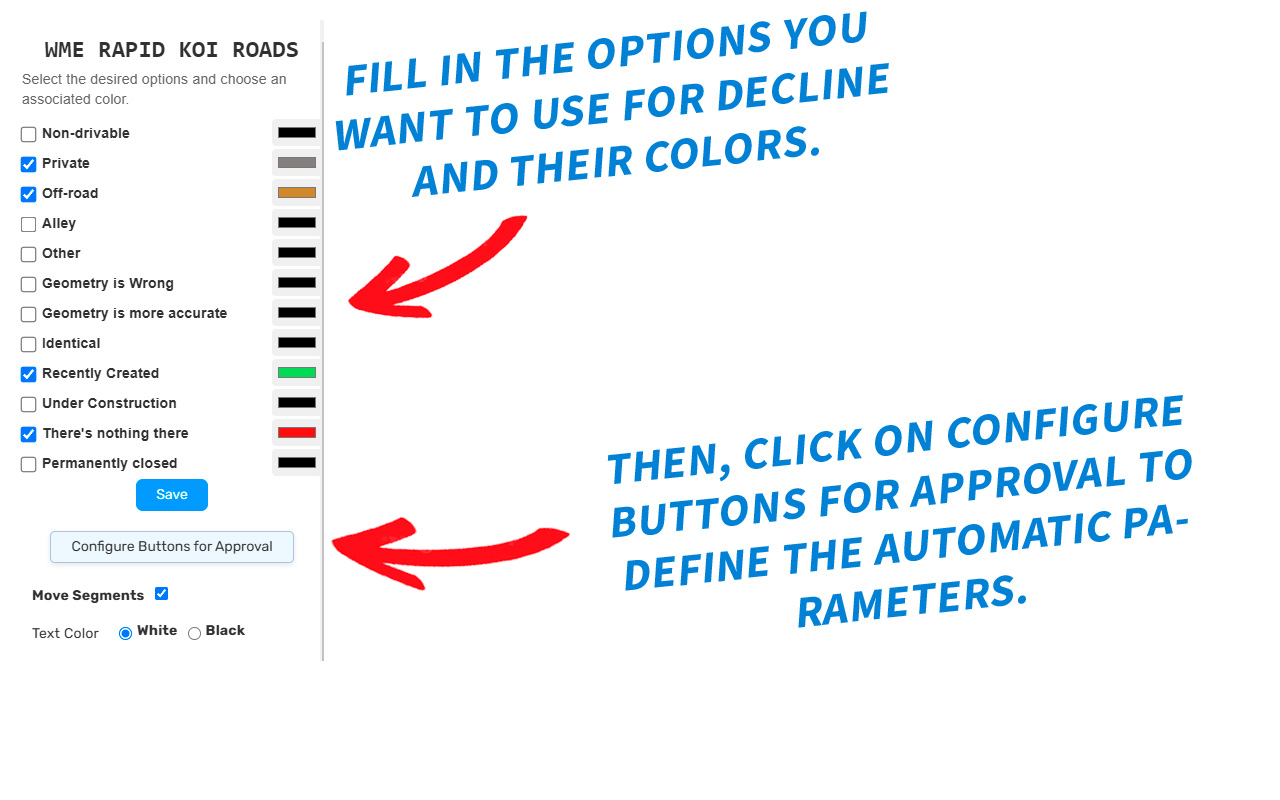
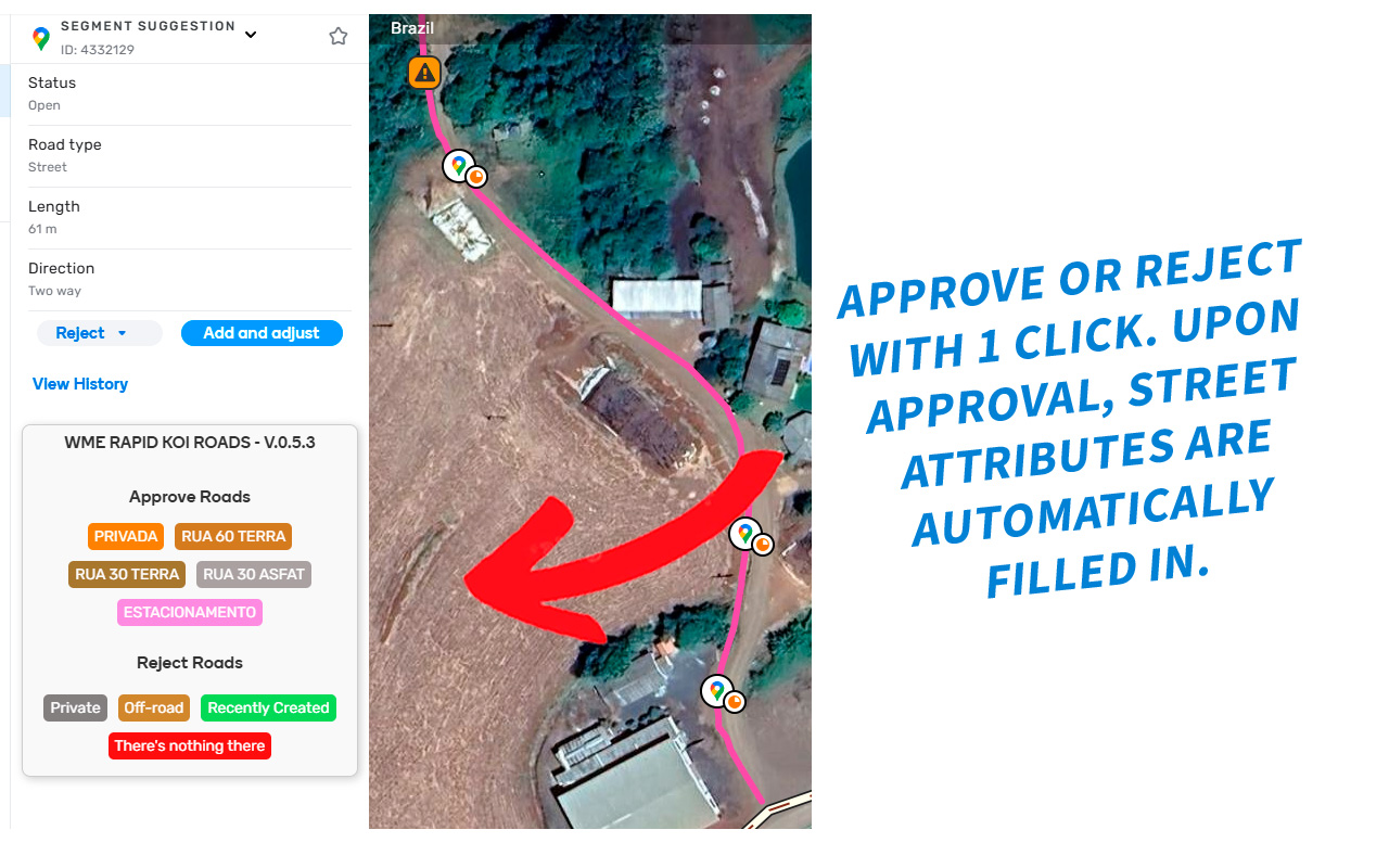
With WME Rapid Koi Roads, you can simplify the process of categorizing and marking roads quickly and visually organized during your time on Koi Fish to approve or reject new roads.
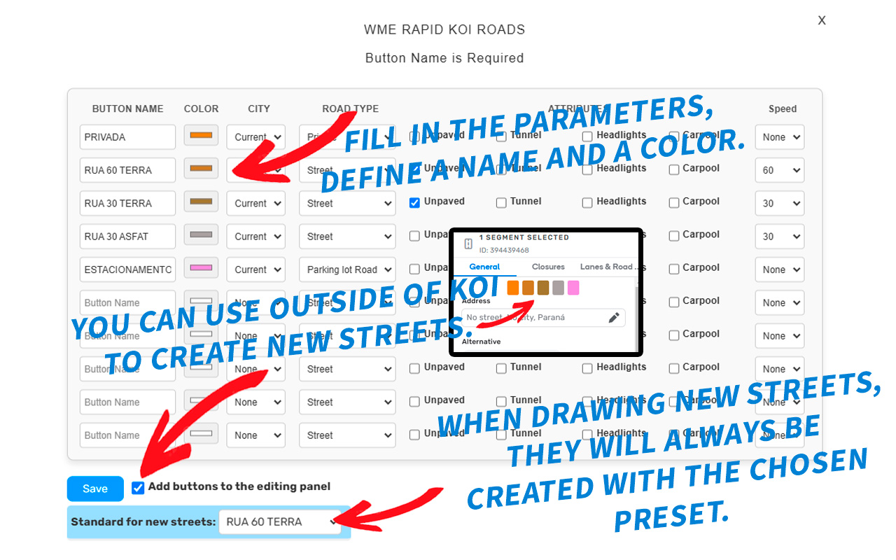
You can set up your own buttons with your preferred colors, as well as define various attributes that will be automatically filled during the approval of roads on Koi Fish, which will significantly increase your productivity
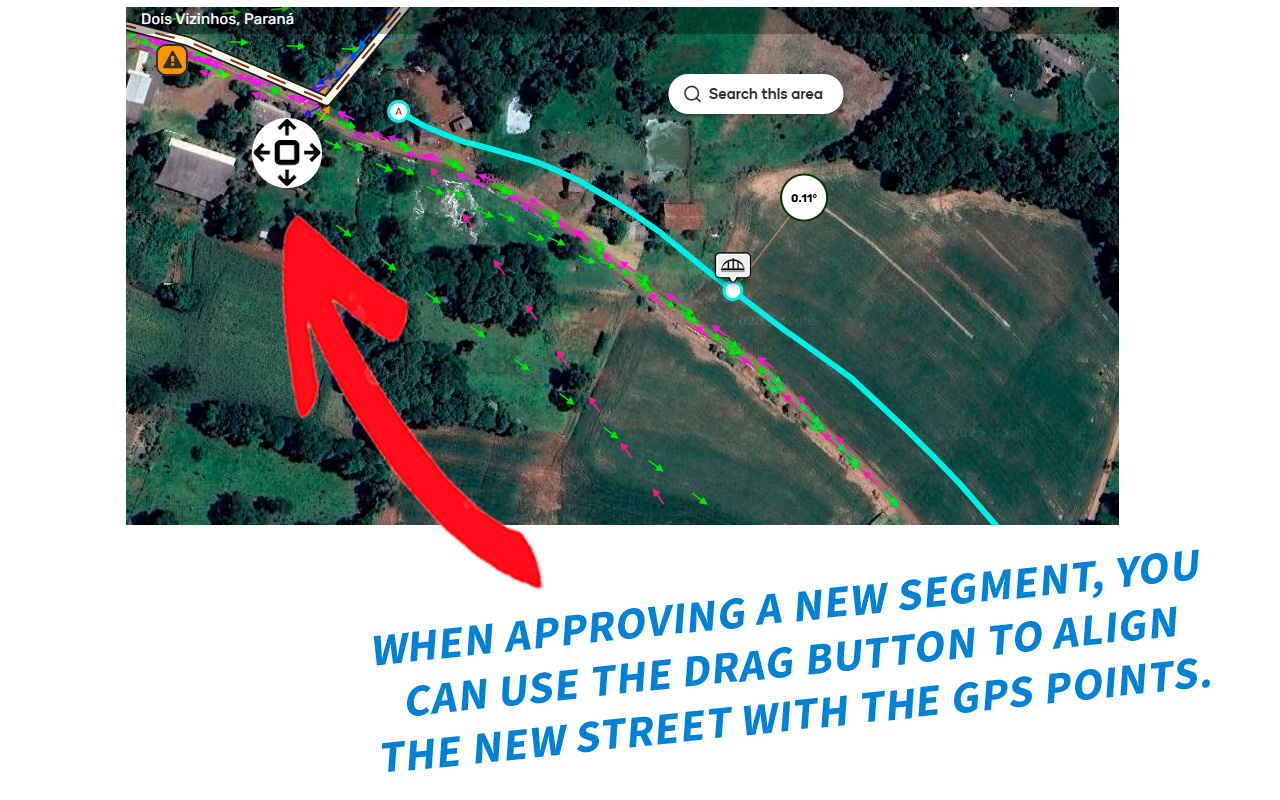
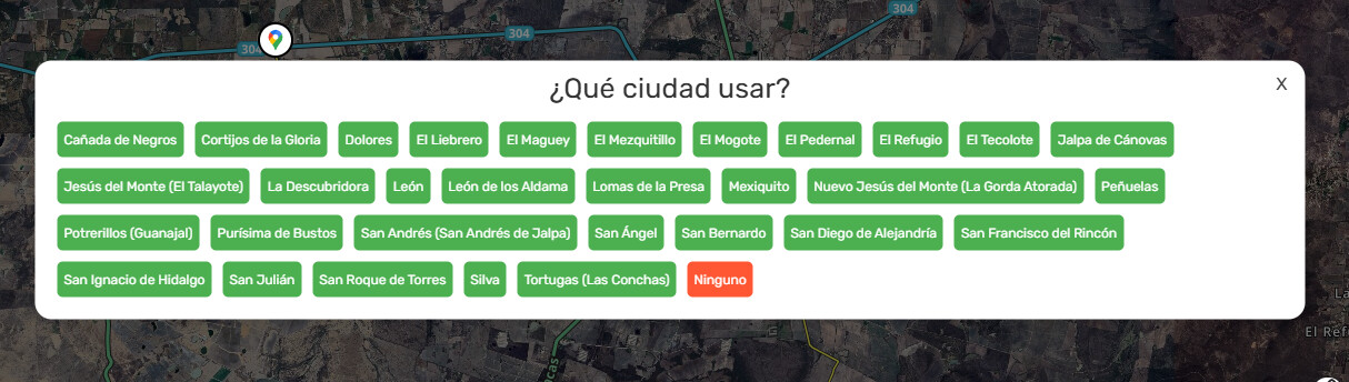
The script has some rules for automatic city filling, if the script cannot automatically identify the city connected to the segment, node or loaded on the map, you will be prompted to choose from the available options. There is also a button to move the selected segments so that you can align the new segments to GPS points.
Additionally, your buttons can also be visible in the editing panel and use a pattern to create new streets.
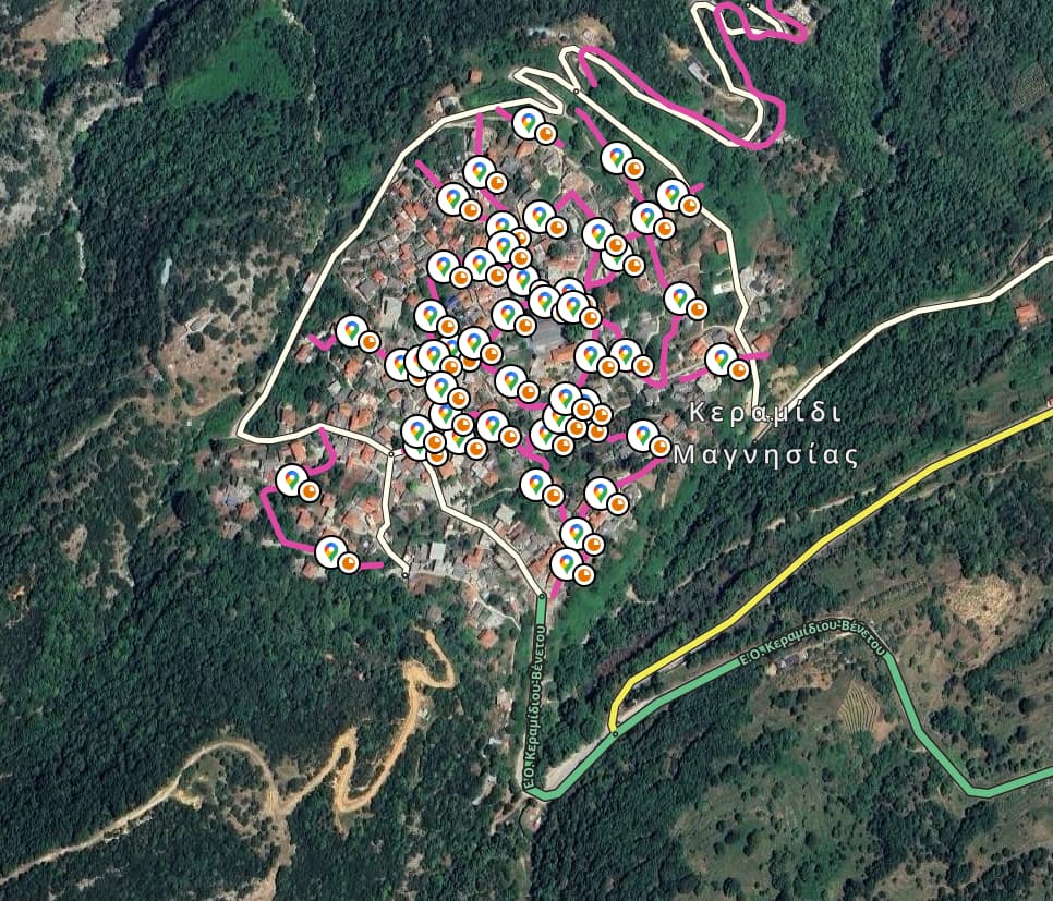
we are doing Map Raid focusing on handling segment suggestion a.k.a KOI in Indonesia. this script help to minimize mouse click when handling segment suggestion
Hello, this happens when there are different city names close to the edit, the script gives the user the option to choose which one you want to use. This is the expected behavior. I found it strange that the script shows so many names, do you have the permalink of the location so I can check? Temporarily, you can change the default of the buttons and choose in the city name column to none, and if necessary, manually change the city name until I resolve this.
I made some adjustments to the selection screen. Now all cities are visible on the screen, I put them in alphabetical order and marked the None option in red.
The update should be available soon. I will check the issue of many cities appearing and sometimes far from the current area in the next update.
Nice one, I don’t see any specific settings in the script, but I’ll test it with the first opportunity
By the way, another suggestion - would it be possible to hide the bubble icon appearing on every single KOI segment? The flashy purple should be enough. I mean, look at this mess
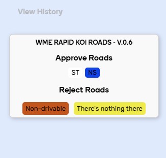
This is just a cosmetic suggestion, but could you please add a button border or shadow (for a more aesthetic look)? Also, please consider adding font shadows (white font with black shadow, or black font with white shadow) because with some color palettes, the buttons and text are currently hard to see or even completely invisible.
Please refer to the photo below. As you can see, the ‘ST’ button blends completely with the background, making it impossible to see. In that photo, if a user selects white font, both the ‘ST’ button and its text become completely invisible.
I have one more suggestion. Currently, when approving a single suggestion, we can set the new segment’s city to ‘current’ if configured that way. However, approving multiple suggestions automatically sets the city to ‘no city’. Could we make multiple-suggestion approval work like single approval—keeping the new segments’ city as ‘current’?
The new version (0.7) includes excellent improvements. The backup storage functionality and future load capability are particularly valuable additions. I also appreciate that selecting multiple segments now displays the current city name instead of ‘None’ - this significantly improves usability. Well done on these enhancements.