I didn’t see this mentioned, but I can only click to see my drives on the first “page” anything after doesn’t do anything, the cursor stays as Select Text not the Link Hand.
Drives are only accessible for ~9 days…
My page 2 of drives is from 4 days ago
Here’s the first one where I can click on all of them
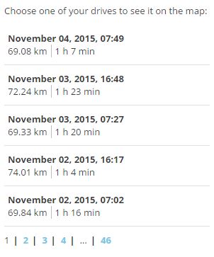
and the second where nothing happens.
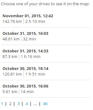
Yep, actually mine is 4 days too now… Pretty bad. Some time ago it was about 14 days…
Oh, ok. Well then, how do I get access to it? ![]() Though admittedly, I access the beta WME so infrequently that you probably wouldn’t see much from me in the Beta forum, so I’m not going to complain if I don’t get access to it.
Though admittedly, I access the beta WME so infrequently that you probably wouldn’t see much from me in the Beta forum, so I’m not going to complain if I don’t get access to it. ![]()
What baffles me is that if there were big issues raised about it in the beta forums, why did they just go ahead and force it on us anyway? Do they really not care about the user feedback they get?
As I said before, they were able to place information in that area in the previous version(s) of WME, without blacking out the entire “info region.” Why they suddenly felt the need to do so is beyond me.
150% agree! ![]()
Yeah, same situation here. On my desktop system at home, I have a nice, big 24" widescreen HD monitor running at 1920x1200 resolution. So other than simply being obnoxious, it doesn’t really create any problems there.
My laptop system, on the other hand – which I take with me when I travel and is what I use if while I’m on vacation to deal with replied-to URs and so on – is a tiny 12" widescreen HD monitor running at 1920x1080. I already have a hard time seeing much because of the available space as it was, and now we get the Black Bar Of Obnoxiousness to add to our fun…
I have to admit, when I saw Olestas’ comment, the first thought that entered my mind was, “This is different from any other time, how?” ![]()
me too.
Closed URs and MPs (green status) still display after saving. Refreshing the map or changing show/hide will remove it.

The issues with Toolbox are being discussed in the WME Toolbox thread.
As was stated before, the same complaints were raised in beta, we were told there are “future plans” for the black bar. It’s still conceivable they might realize their misstep at some point and take it back out.
But this is hardly the first time something has been pushed to production, which was highly disapproved of in beta.
i would imagine something like TB could add a switch to turn the bar off… ![]()
If the bar isn’t working at this time, why have it up in the first place. Can the bar be removed until it’s fully functional? At this time it serves no purpose but to hog the available screen real estate.
IME, beta testers’ feedback is ignored if it’s a dissenting opinion regarding a new UI change (ref black bar, new very big user-profile div, reversing the ordering of road attribute form fields so the street/city name and none/none tick boxes are now furthest from the “apply” button as is possible in the space allowed).
Feedback is only taken on board if it’s a bug, but they too are pushed to prod if they’re not deemed show stoppers (e.g. layers now not sortable)
The UI devs seem to have free reign and the last word on any UI changes. Usability is not considered.
Yeah, I know it’s been stated here before. My comment wasn’t directed at you or anyone else posting these points here. It was more of a general grumph in the (probably forlorn) hope that the Devs are reading any of this and might be moved by the comments to do something about the new “feature” that’s not so well designed (IMO).
Which kinda makes you wonder why they even bother to have beta testers, since they apparently just ignore whatever feedback the get from those testers… :?
Wouldn’t that be a nice new feature for TB…? ![]()

And that’s truly sad, given that better functionality means less frustrated editors – those same (free labor) editors who are adding value to the map that they’re making their living from. ![]()
You obviously don’t know me very well…I never forget. I just bottle it up and let it all go when the time is wrong.
Anyone else having weird zooming issues on URs?? When I click the UR it zooms to what seems to be a central point in the Waze provided route/GPS trace, instead of the actual UR.
I can confirm. However, it only happens where a GPS or User track present.
It’s like closing a road two months before construction starts. :roll:
But you know there are municipalities that do that. :lol:
Having the black bar (it’s not really black) is the same as changing the colors on the road layer…I’ll let you fill in the blank.
It’s like wiping before you poop? :lol:
I’m not on beta WME, but I have to agree that this is apparent from the post-release comments I’ve seen from beta testers for the last 18 months.
But some things that are changed for the sake of change? Simply dumb.
Swapping “Apply/Cancel” on street name right and left is annoying.
Likewise flipping the name attributes (and the check box seems to be smaller and harder to hit)
The HUGE title box?
Ya… the points and edits are nice to have there.
Do we have to have the picture and the “You can edit” information taking up 5 full lines?