Notice anything different? Brand Refresh has been launched!

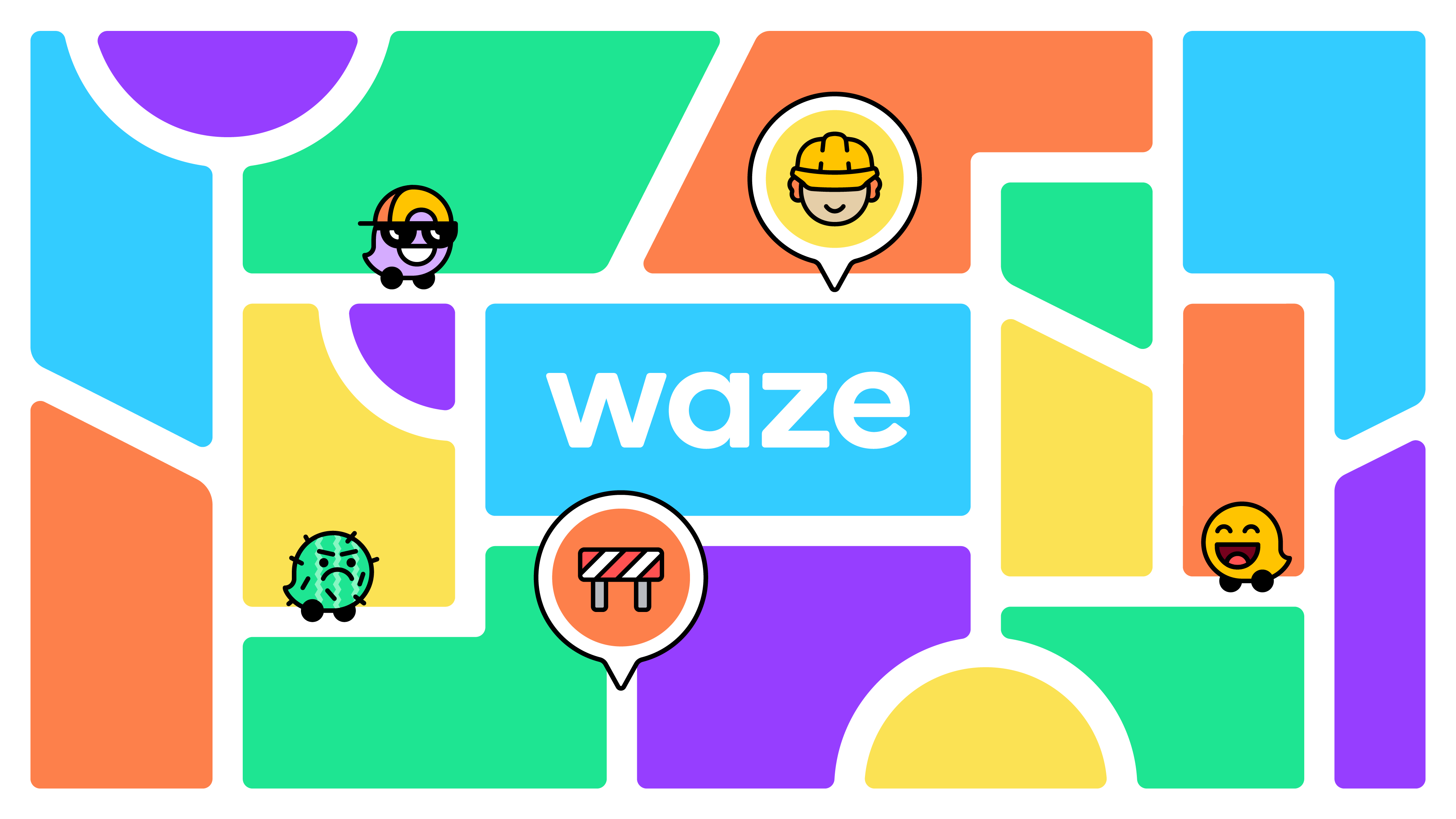
Block_by_Block_ShortBanner.pngWhen you open Waze today, you might notice we’ve got a fresh new look; New moods, new icons, and new colors!
The Brand Refresh has been launched and we are all very excited to hear your feedback and share fun materials with you!

As Tim shared in this Sunday’s Office Hours session (find the recording here), we’ve got some great assets for you -
Here’s an animation,
and here’s a static image.
Feel free to share those on your channels!

We will gradually share more materials.
The best source for newly released assets during the coming days are Waze’s official channels over Facebook, Instagram and Twitter.

Waze on!
Anat, on behalf of Waze’s Communities team.
官话 / español / हिन्दी / português / русский / 日本語 / Türkçe / français / Deutsch / italiano / polski / …

Tradução pt/br no meu inglês macarrônico:

Notou algo diferente? A atualização da marca foi lançada!!!

Quando você abrir o waze hoje, poderá notar que temos um visual totalmente novo; novos humores, novos ícones e novas cores!

A atualização da marca foi lançada e estamos muito ansiosos para ouvir as suas opiniões e compartilhar materiais divertidos com vocês!

Com Tim compartilhou no Office Hours de domingo, temos ótimos arquivos para vocês:
Uma animação e uma imagem estática! (links no post original acima)

Sinta-se livre para compartilhar em todos os seus canais!

Iremos gradualmente compartilhar mais materiais!

A melhor fonte para os novos arquivos a serem liberados nos próximos dias são os canais oficiais do waze como Facebook, Instagram and Twitter.

Anat, em nome do time de comunidade do Waze.

Thanks Anat. But why this in China sub-forum?

It is currently a global post and all replies post to every forum page until they change it from global.

I did not like it, I prefer the previous one.

Nice fresh look! Thank you.

Somehow I agree with that. Especially the female mood was ditched. It sounds like proposing some kind of ideology and forgetting reality.

Very nice. I love it.

I did not like it, I prefer the previous one.

I like the new font and playfulness of the design, but the new logo seems a bit stiff and less friendly than the old one.

Brand new look, just not for me… Sunflower mood especially brings me down.

While the rest of it is bearable, most new moods are awful.

Hey guys, it’s flashmob time!
“I did not like it, I prefer the previous one.”
:lol:

Greetings, thank you very much for the news of the makeover, very cool everything